May 12, 2014
Next-Gen Web Design
A few weeks ago I wrote about Sony’s new campaign, “Be Moved”, which uses a fantastically attractive parallax site design. That got me thinking, “I wonder what other companies use parallax sites?”.
For those of you following along at home, parallax scrolling is where a site uses scrolling movement, the objects in back moving slower than those in front to create a 3D effect. This can make the site a lot more interactive and entertaining, but it can also become busy, even slow your browsing speed quite a bit. Here are a few sites that did it right:
Highway One:

This is a VERY entertaining site! It’s one of the few I’ve actually explored most of the way through. By scrolling up and down you drive down the famously scenic highway and learn about tourist attractions. It is really a work of art!
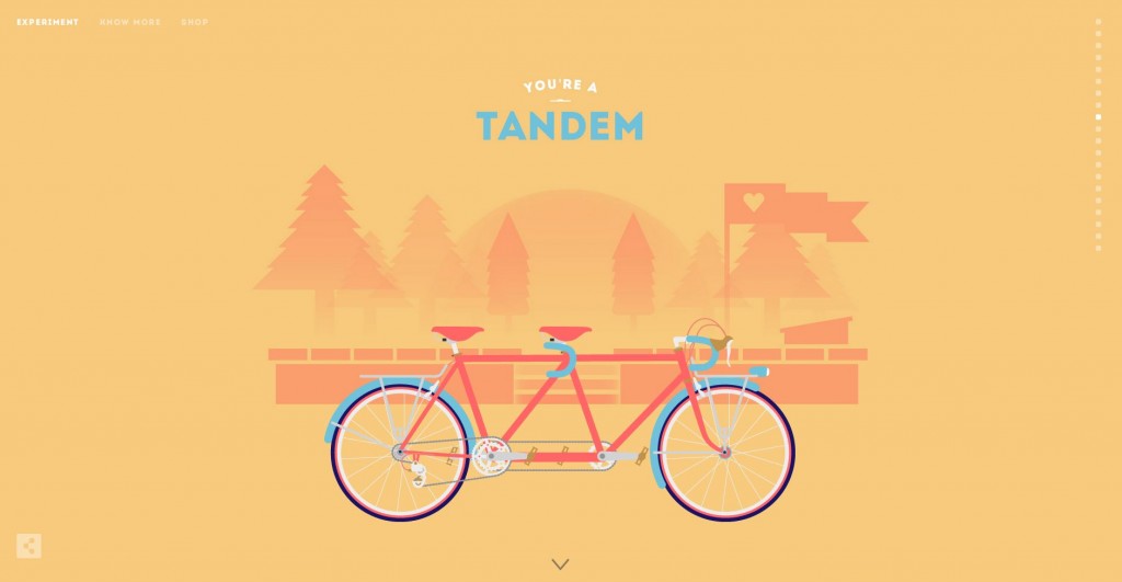
Cyclemon:

Not only is this one of the most attractively designed sites I’ve ever seen, it is both simple and entertaining. Check out the teaser, too! The animations, colors, and basically everything else that this company is doing could not be better!
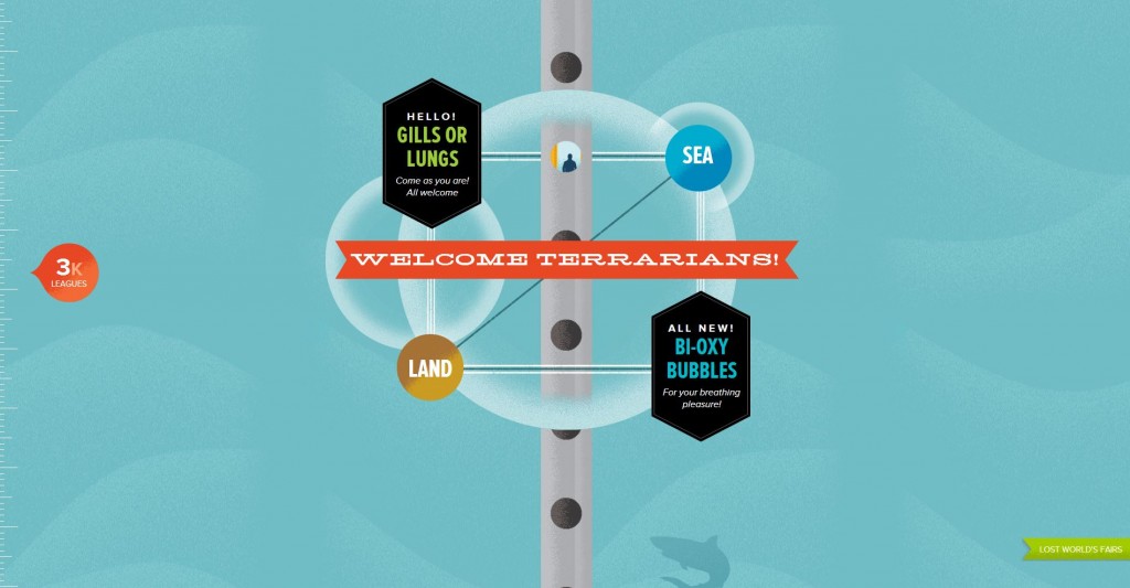
Atlantis World’s Fair:

This site, like many parallax pages, makes you work for it. This is a bold move! Making your visitors scroll past loads of other stuff to get what they came for is not exactly intuitive! But it works. Brilliantly. Check out this website and scroll 20,000 leagues under the sea!
Great web design is not only key for web traffic, it also sets the tone for your customer’s whole experience. Here at Innovation Simple we’ve got what it takes to make your site look great AND give your customers an experience they will remember.

